Data Visualization with R Ch 2
Abinezer Abebe
STEAM
Data Preparation CH 2
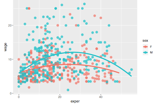
Introduction to ggplot2 in Chapter 2. We worked on ggplot2 packages. The first part in building a ggplot2 graph is creating a ggplot2 function. In building the graph there are two major part’s data and variables mapped to show the graph. The variables are strategically placed within the function. The next step is to add Geoms to our scatter plot graph. Geoms are objects that can be graphed using the Geom_ function. In our scatter plot graph there is an outlier that is larger than the rest of the wages in the graph showing the relationship between wages and experience. I took the outlier in data out and redesigned the scatter plot graph. Next I played around with parameters that controlled the color transparency and shape to redesign the graph. After I grouped the variables in two categories of male and female. The color that I chose for male was blue and female I chose pink. The variable colors fall under the ‘aes” function because we are messing around with the aesthetics of the scatter plot. Scale_ allows us to change the X & Y scaling format. Next I created facets using the facets_ function and labels using the labels_ function. Labels make it easier for our user to know the legends of the scatterplot and don't force them to make guesses. Next I applied the Theme function which controls color fonts and Grid lines to change up the theme of the overall graph. Now that the graph is finished it displays information in an efficient manner.


Comments
Post a Comment