Data Visualization with R Ch 3
Abinezer Abebe
STEAM
Data Preparation CH 3
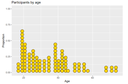
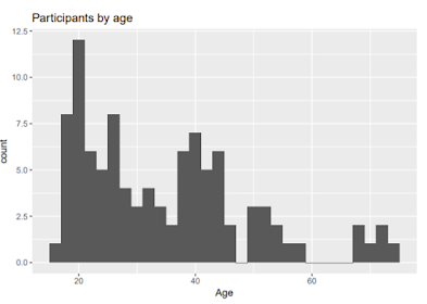
In Chapter 3 we started to learn about univariable graphs. These types of graphs are plotted based on a singular variable. The first Chart we looked at was a data set that contain the records of 98 individuals in Mobile County Alabama. The data was about marriage records based on race of the citizens in Alabama. In the Rstudio IDE we plotted the data set to see the presented graphs. After graphing the data I noticed some Key points. Coming in first Whites had the highest marriage records in second were Blacks they the second highest the last groups were Hispanics and American Indians. The next step in modifying our graph was using the "aes" shortcut to represent it in a percent. The data also needs to be in ascending order and labeled per bar. This would make the data more presentable , we added percent labels it was more easier to read percent's per bar. We then applied a graph that based marriages on their officiates. Another alternative to a pie chart is a tree map. Tree maps are more effective then a pie chart because they can handle variables with many levels. We then executed different styles to try on the graph to see what best fits. The dot chart was the most reasonable way to show this dataset.


Comments
Post a Comment