Posts

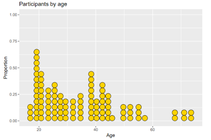
Computer Science Programming Language Blog 3

Image
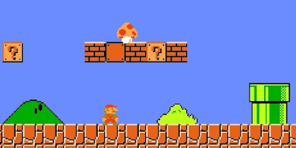
Abinezer Abebe STEM  Week 3                                       Computer Based Programming Languages Research   Most video games are made from custom code based on the C programming language. Game programming requires substantial skill in software engineering. There are 7 phases a program goes through before the game is published. The first and important is prototyping. The programmer might write down some ideas and figure out the game plans and how the game would work. Is the game going to be multiplayer is the game going to be online ? The programmer would come up a concept. Next step would be the game design. Here the programmer might Collab with others to deign the characters the game scene. Programmers often follow closely the game design that they have set. As they code every line of the program they capabilities are discovered and exploited. During produ...

Computer Science Programming Language Blog 2

Image
  Abinezer Abebe STEM  Week 2                                       Computer Based Programming Languages Research   There are varies types of computer programming languages. Python is a interpreted programming language. Interpreted programming languages it incorporates modules exceptions and dynamic typing. Its a very high level programming language. Pythons writability and readability is why its ranked so high on most popular languages next to java and C. Python code is easily portable and has thousands of free open code programs. Why would a user choose python over C? C programming language works well with internal software and while python is a general all purpose language that can complete most tasks. Taking a look at python and C. C was first used in 1972 and designed by Dennis Ritchie and Bell labs. The main purpose of C at the time was for US Army dev...

Data Visualization with R Ch 5/6

 Abinezer Abebe STEAM  Data Preparation CH 5/6 In Chapter 5 I worked on Multivariate Graphs. They display graphs between multiple variable. The two most known ways to accommodate variables is grouping and faceting. The first example we looked at is grouping and we mapped them to the x and y axes. Grouping allows us to plot multiple groups of data  in a single graph. We looked at the relationship between yrs.since.phd and salary. Next we added rank and gender to the graph. Another method of graphing the years since Ph.D and Salary using the size of the point is referred to a bubble plot. In the bubble plot we have two legends yrs.service and rank. Inferring from the graph we can see that more years in service the more likely to become a Prof and not a AssocProf or AssProf. In the final example we take a look at the life expectancy of counties in North and South America. The life expectancy is increasing in each country expect Haiti they lag behind in the graph. In Chapter ...

Data Visualization with R Ch 4

Image
 Abinezer Abebe STEAM  Data Preparation CH 4 In Chapter 4 we learned about Bivariate graphs. Bi stands for two so Bivariable graphs displays information between two variables. In the first example we plotted the relationship between automobile class and drive type based on front wheel drive rear wheel drive and all wheel drive. From observing the graph we notice that all 2 seaters sport coupes are all rear wheel drive while most common car the SUV is more commonly 4 wheel drive. We adjusted the graph to a group bar look. Then applied a segmented bar chart using the position = "filled" option. Improving the graph coloring option using the factor scale_y_ labs ,scale_fill_brewer and theme_minimal functions. Next we used the geom_text function to ass labels to each bar. Scatterplots are one of the most easiest ways to display data we graphed one for the years experience vs salary for collage professors. Using the geom_point function to edit our graph. Next we need to add the lin...

Data Visualization with R Ch 3

Image
 Abinezer Abebe STEAM  Data Preparation CH 3 In Chapter 3 we started to learn about univariable graphs. These types of graphs are plotted based on a singular variable. The first Chart we looked at was a data set that contain the records of 98 individuals in Mobile County Alabama. The data was about marriage records based on race of the citizens in Alabama. In the Rstudio IDE we plotted the data set to see the presented graphs. After graphing the data I noticed some Key points. Coming in first Whites had the highest marriage records in second were Blacks they the second highest the last groups were Hispanics and American Indians. The next step in modifying our graph was using the "aes" shortcut to represent it in a percent. The data also needs to be in ascending order and labeled per bar. This would make the data more presentable , we added percent labels it was more easier to read percent's per bar. We then applied a graph that based marriages on their officiates. Another...

Data Visualization with R Ch 2

Image
 Abinezer Abebe STEAM  Data Preparation CH 2 Introduction to ggplot2 in Chapter 2. We worked on ggplot2 packages. The first part in building a ggplot2 graph is creating a ggplot2 function. In building the graph there are two major part’s data and variables mapped to show the graph. The variables are strategically placed within the function. The next step is to add Geoms to our scatter plot graph. Geoms are objects that can be graphed using the Geom_ function. In our scatter plot graph there is an outlier that is larger than the rest of the wages in the graph showing the relationship between wages and experience. I took the outlier in data out and redesigned the scatter plot graph. Next I played around with parameters that controlled the color transparency and shape to redesign the graph. After I grouped the variables in two categories of male and female. The color that I chose for male was blue and female I chose pink. The variable colors fall under the ‘aes” function because ...

Data Visualization with R Ch1

Image
Abinezer Abebe STEAM  Data Preparation  This semester we will be working on R. R is an integrated suite of software facilities for data manipulation calculation and graphical display. R was inherently made for statistical computing and graphics of data and very similar to the S language. Which means code written in S can run syntax free in R. R provides a wide range of statistical linear and nonlinear modeling. Often used as the choice in statically methodology. It was very simple and easy components such as mathematical symbols and formulae. R is a great design choice for a user to retain control. R runs on wide range of operating systems like Linux platforms FreeBSD Windows MacOS. This week I worked on getting my R IDE configurated and ready to take in data. The R environment is very effective at data handling and storage facility. Operators for calculations on an array or matrices is possible in R. R has coherent integrated collection of intermediate tools for data analysis...